St. Mary’s University – SET Innovation Center
The university firmly believes in educating for service, justice, peace, integrity, and adaptation to change.
Client: St. Mary’s University
Market: Higher Education
Project Area: 25,320 sq. ft.
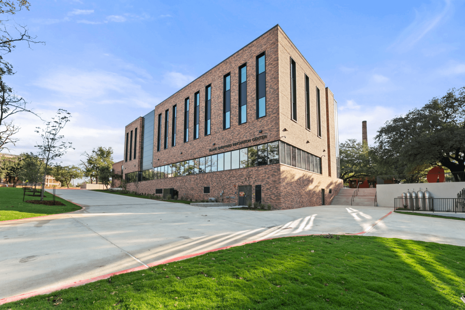
St. Mary’s University campus was founded in 1852 and is the oldest Roman Catholic university in the Southwest.
Their 135-acre site is located on the West Side of San Antonio. It offers multiple undergraduate and graduate degrees with numerous special academic programs, able to serve more than 3,200 students. The university firmly believes in educating for service, justice, peace, integrity, and adaptation to change.
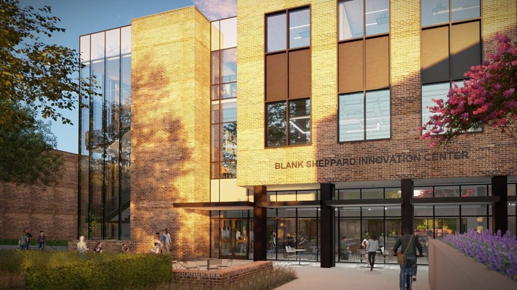
PBK has extensive experience in creating conceptual designs and marketing materials
St. Mary’s University sought PBK’s assistance in 2017 to develop their initial fundraising package for a new educational facility, the Innovation Center, which would house programs in Science, Engineering, and Technology (SET).
PBK has extensive experience in creating conceptual designs and marketing materials. Our team of designers and visualization specialists can quickly develop plans, renderings, and other visuals to generate excitement among potential donors about the University’s future.
The PBK Higher Education studio in San Antonio was given the green light to kick off the design of the newest addition to their main campus in 2020. In August 2021, the university formally announced the project, describing it as their newest two-story building called the Innovation Center. However, in December 2021, the university revealed a secret that would change the building design and the programs offered on campus. For the first time ever, the university was planning a Bachelor of Science in Nursing program and would need the appropriate facilities to house the future instructors and labs. This unexpected development meant that the design team had to shift gears during the schematic design phase and find a way to add a third floor dedicated to the upcoming nursing program. As of the October 2022 groundbreaking, the university had formally announced the planned addition of their nursing program and revealed the official name of the building to be the Blank Sheppard Innovation Center.
Design
The design team was tasked to develop a building that visually represented innovation but easily fit into the context of the 170-year-old campus aesthetic. The new site was centrally located between several existing buildings, so it was vital that the building look new and inspired but also feel like it had visible ties to the history and culture that is evident in all the structures surrounding it. To accomplish this, the team used the existing campus brick as the basis of design and played with the proportions, volumes, glazing, and textures. The existing brick and bronze metal canopy give the building its contextual familiarity, while the clean lines, volumes, controlled brickwork, and increased amount of glazing give it a crisp and tailored look.
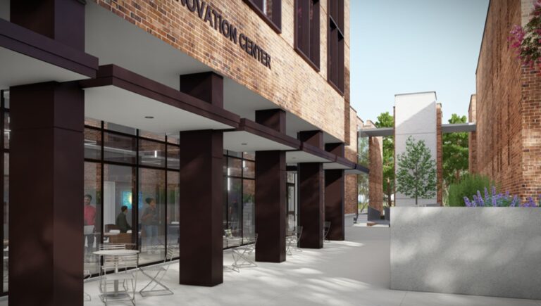
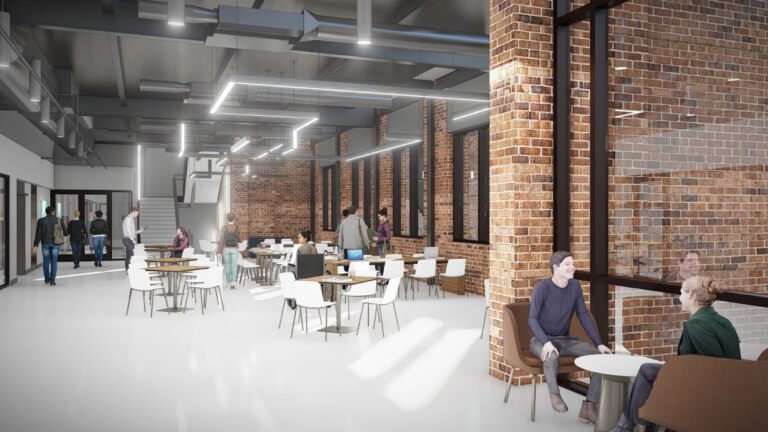
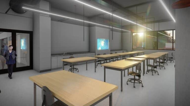
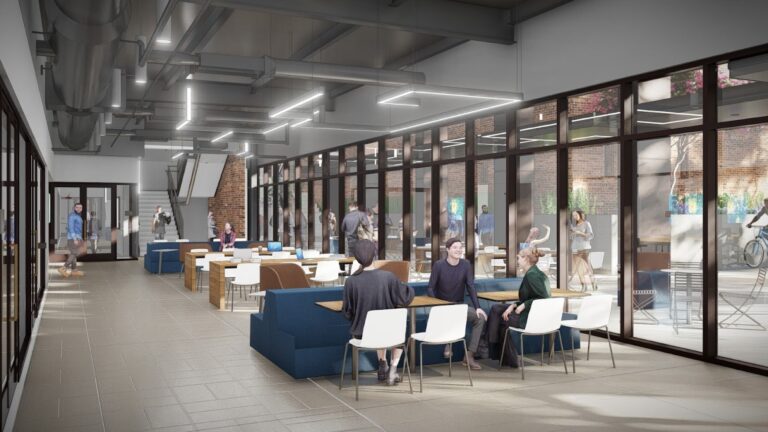
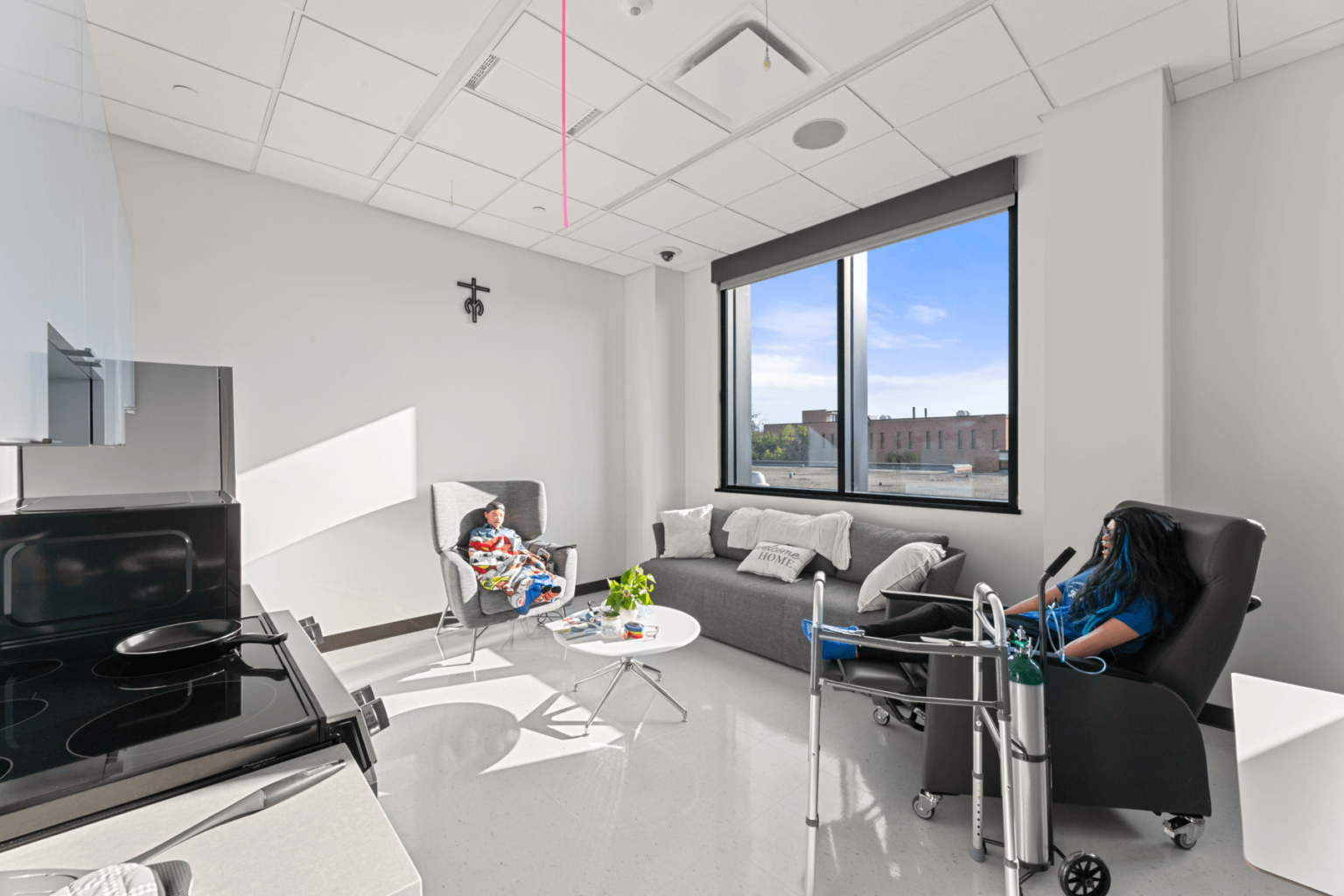
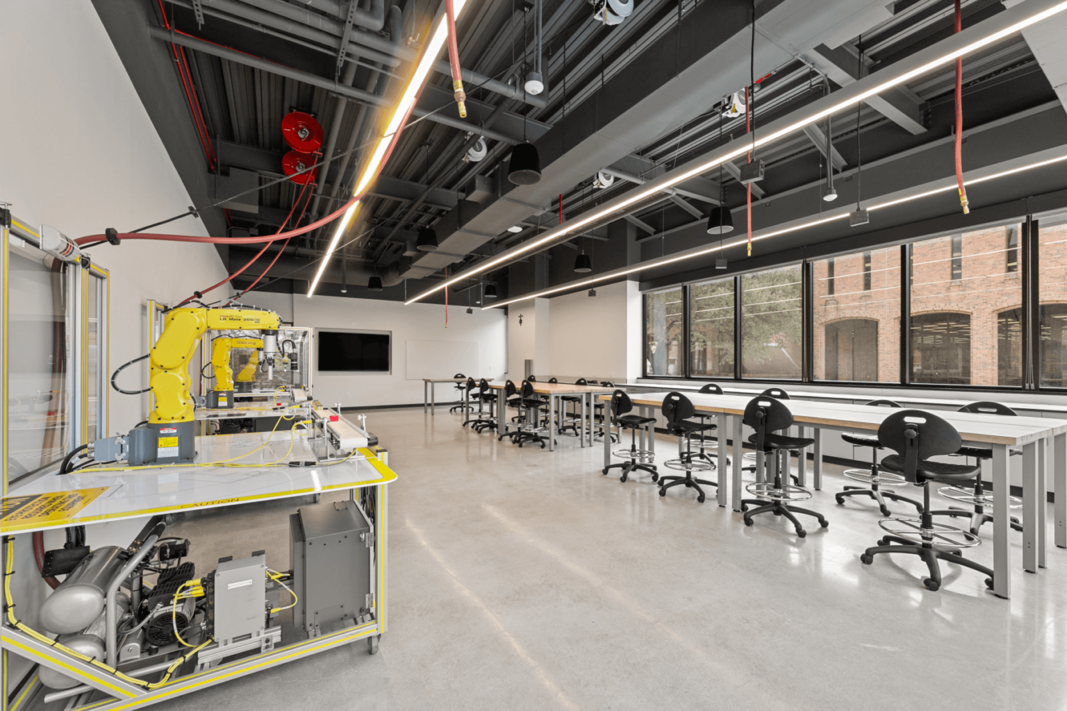
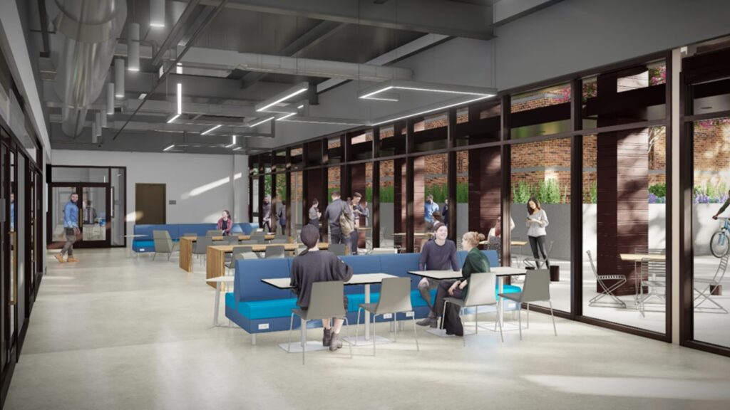
The new three-story building is approximately 27,000 square feet and will be home to seven new SET labs with significant infrastructure upgrades, a large multi-bed nursing lab, a nursing simulation suite, a home care lab, sixteen new offices and several large student spaces. The design team was asked to create a lobby on level one that paid homage to the older building interiors but felt like it belonged in an innovation center. It is to be inviting, warm, familiar, but clean and full of light. To do this, we looked at the interior finishes of the surrounding buildings. Several of them shared similar brick paver flooring and were even laid in traditional patterns. Our solution was simple. We decided to do a large-scale basket weave pattern using a rectangular porcelain tile, simple white walls, exposed ceilings, a fun linear light fixture, and a hint of the exterior brick. The clean lines and warm finishes of the furniture help finish out the inviting space.
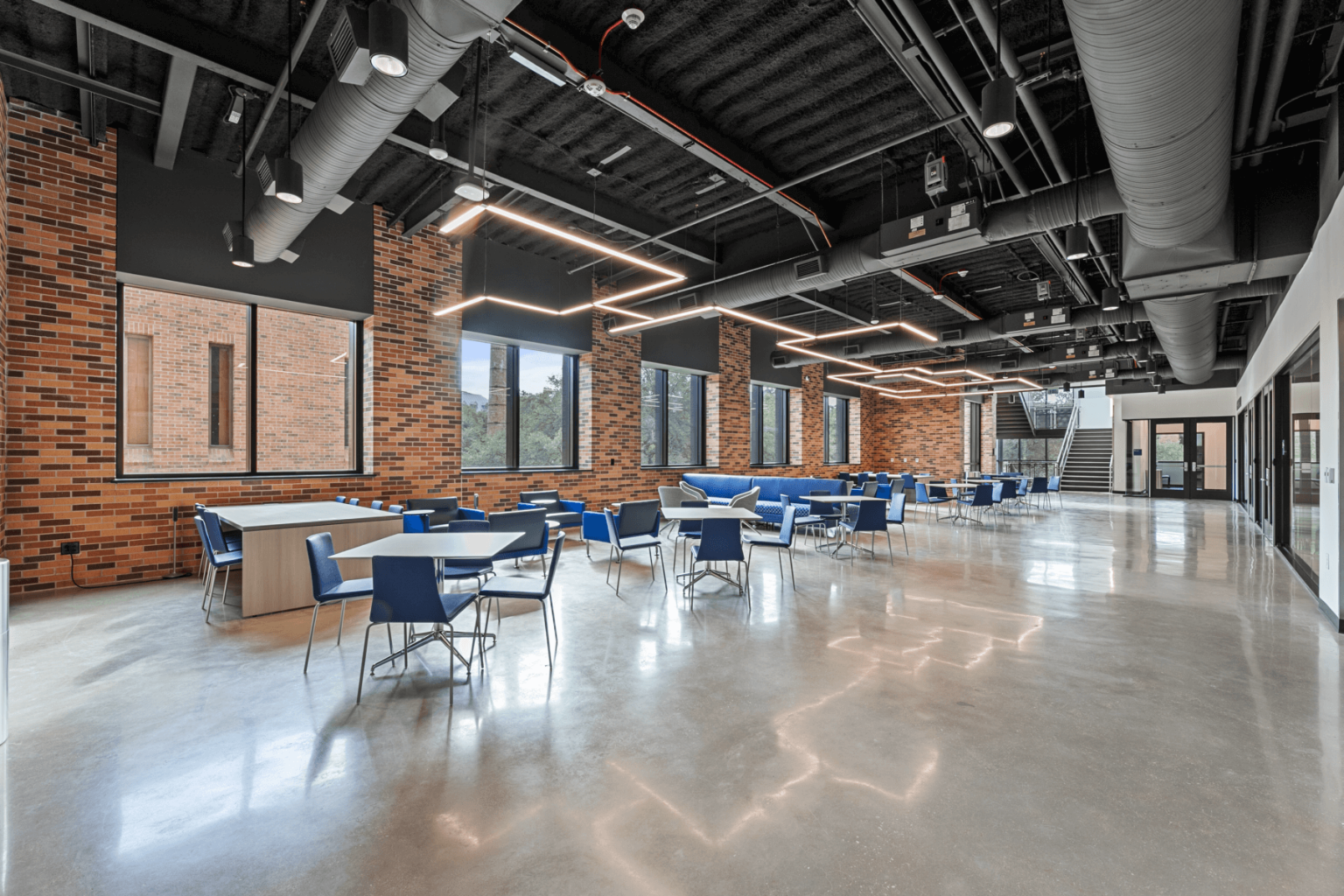
The finishes for the new building had to fit the visual notes we were seeking, and it had to be functional. Finishes had to be durable, easy to maintain, and chemically resistant. All the labs, restrooms, storage, and student areas on levels two and three were scheduled to have sealed concrete floors and exposed ceilings. The level three nursing labs are intended to replicate real-life clinics and hospitals, so we specified homogeneous sheet flooring with an integral base, cleanable ceiling tiles, and scrubbable paint.
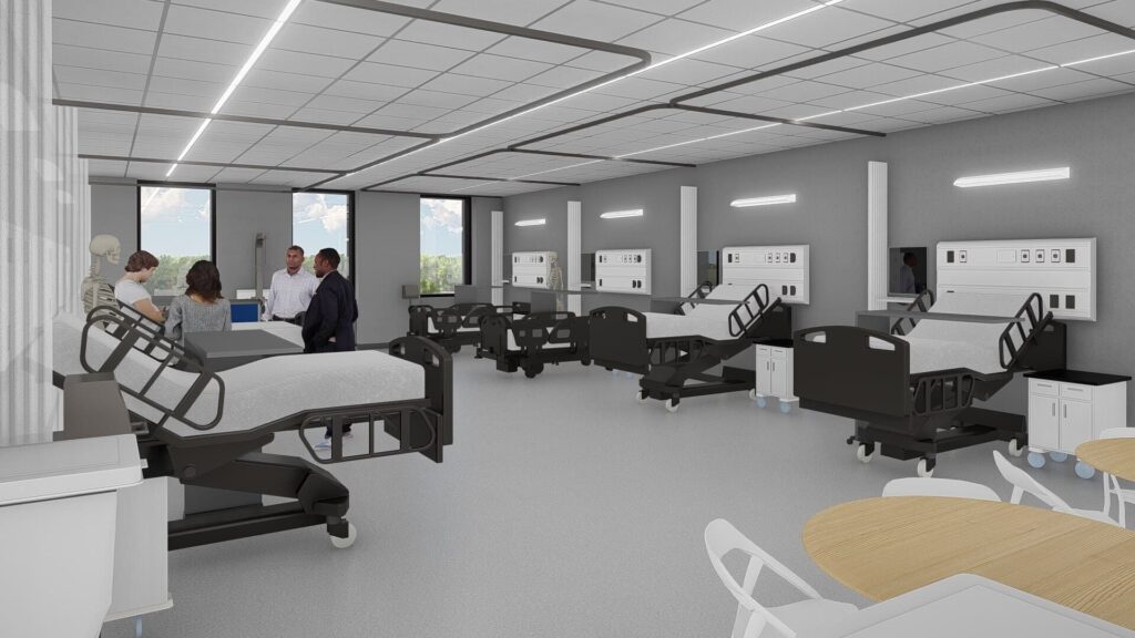
All lab casework was specified to have chemical-resistant phenolic countertops and painted base cabinets. The restrooms keep the industrial feel by using a large format tile that has the look and feel of formed concrete.
Finally, to take advantage of the natural light, the new offices are strategically located at the corner of the building, each with their own faculty break area. They are finished out using a basket weave tile pattern.
